
Project Overview
Savorite is a voucher app that connects restaurants with diners by incentivizing dining during off-peak hours with discounts.
Business Goal
Increase user turn-out and engagement through a user-friendly app.
Solution
With the app's goal of driving the community to eat out and explore local dining options, it is fundamental to ease the discovery and search of users. Therefore, I decided to focus my redesign on the search, filter, and home page of the app.
My Role
This was a solo project that I worked on as a design intern at Savorite. I conducted user research, competitive analysis, and drafted two iterations of the High-Fidelity Prototype.
Timeline
July 2021 - August 2021
Tools
Figma, Adobe Photoshop
What is Savorite?
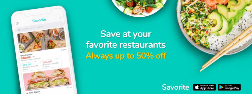
Savorite is a small startup in San Diego that connects restaurants with diners by incentivizing dining during off-peak hours with discounts through a free voucher app. Savorite takes pride in being an easy-to-use app that drives diners to connect with their local small businesses.
Signing up for a discount is EASY.
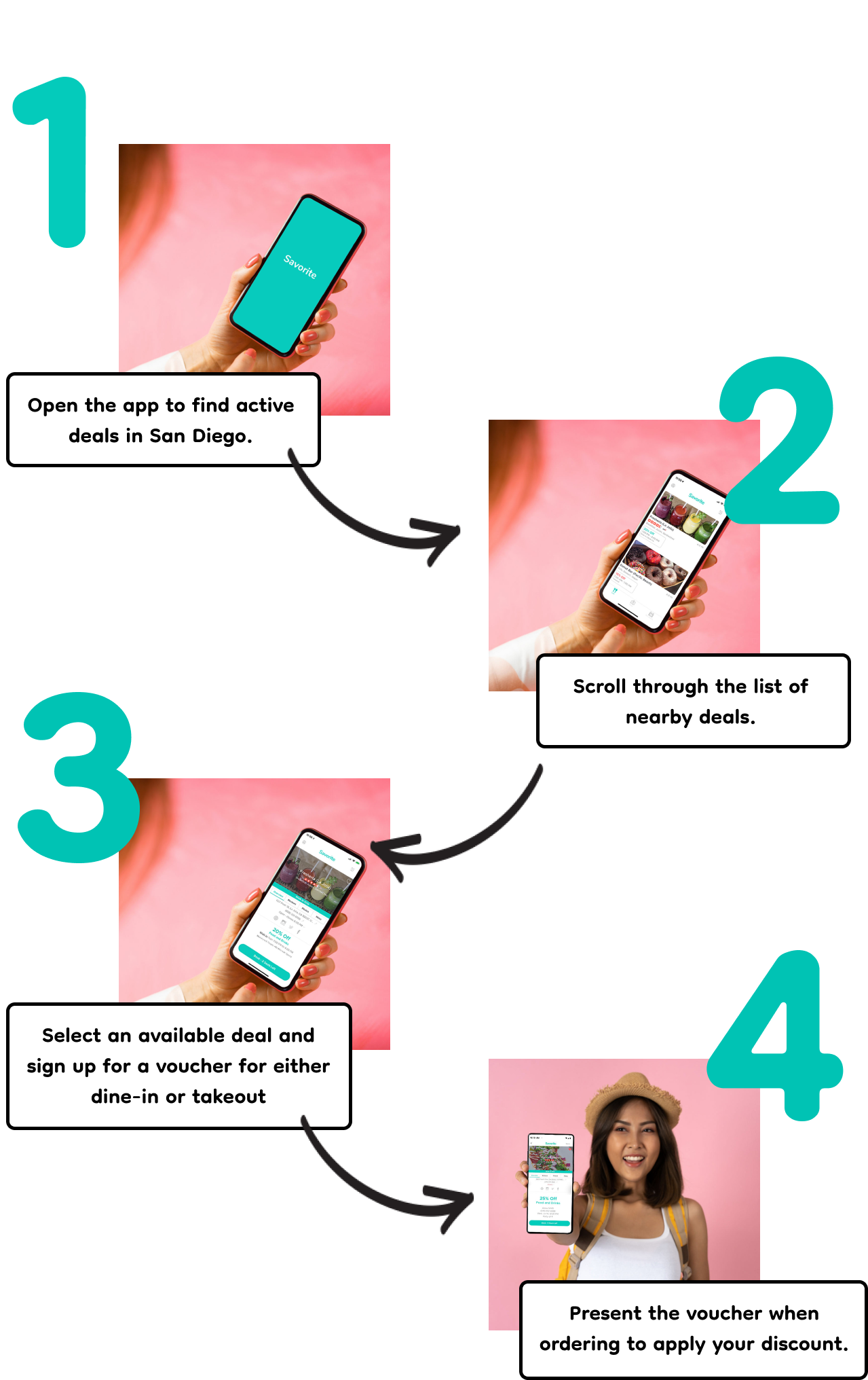
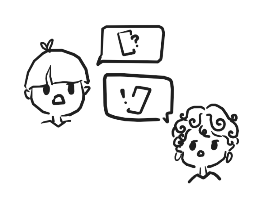
Meet Jessie

Jessie is a college student who is hungry after finishing her lectures at 2 PM. She opens Savorite to find a deal that is available nearby.
Jessie scrolls and scrolls and scrolls. She doesn't know what she wants to eat, so she just hopes for something good to catch her eye. Jessie keeps on scrolling.
Uh Oh!
Jessie decides to eat at a dining hall after deciding the app was too much of a hassle to use.

While attaining the discount is simple, the lack of search features made finding a restaurant of interest difficult. Without proper organization and search features, problems will arise when there are more dining options users like Jessie will have to scroll through. As a Savorite design intern, I took the opportunity to approach these challenges and investigate ways to improve the overall user experience through a redesign.
The Problem:
As more dining options become available on the Savorite app, it becomes essential to have an easy-to-navigate interface for diners to quickly and easily locate deals and restaurants of interest.
Research
App Analysis
First, I downloaded the app to make an in-depth analysis of the current functionalities, overall architecture, and navigation. I then compiled a list of usability issues and pain points which I will validate in my User Research.
Competitive Analysis
Because Savorite's target consumers are diners and college students, I decided to analyze a couple of popular and similar dining apps for those populations. I downloaded Eatigo, Crave, Yelp, Grubhub, and Uber Eats to analyze the functions and features offered.
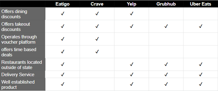
Comparing Usages
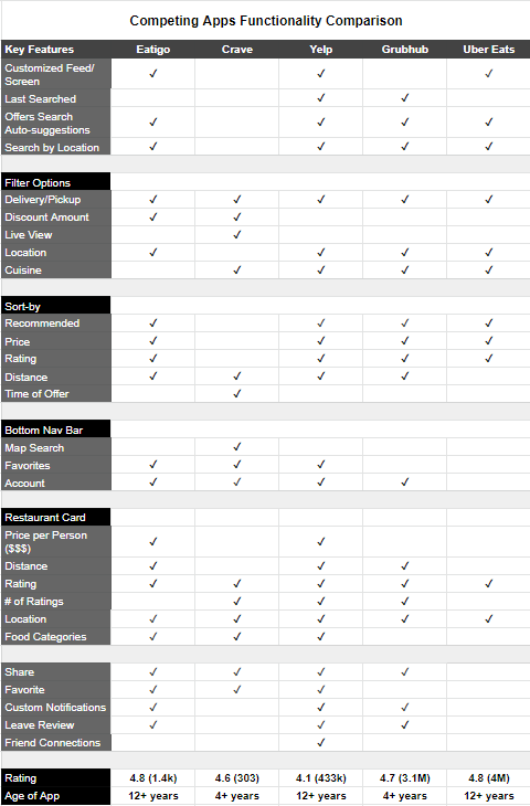
Comparing Functionalities
Review Analysis
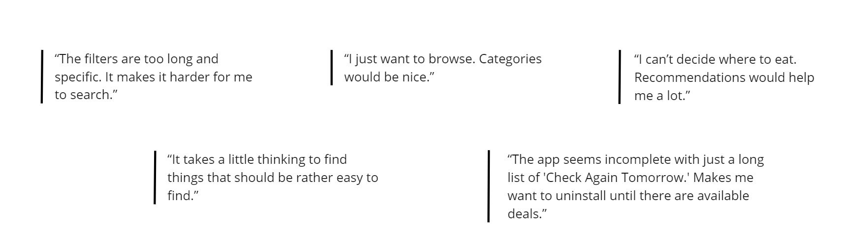
Unfortunately, Savorite is new and doesn't have critiques from users yet. Therefore, I decided to investigate user feedback from similar dining apps such as Eatigo and Crave which have a larger user population and have been around 4+ years. I found a couple relevant reviews. Most of the user complaints revolved around both apps' inconvenient search architecture.
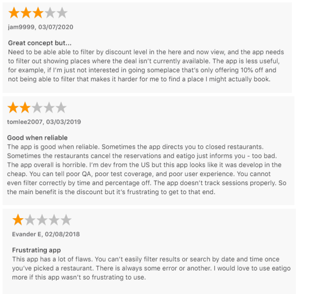
1. Filter: Users would like options to filter by discount level, time, location, and by any other method rather than scrolling through a list of restaurants.
2. Poor organization: Placement, size of fonts, and over- crowding of information in the apps lead to user confusion or missing key information.
3. Missing/Incorrect features: Why have a "Reviews" section where no user reviews are displayed? There are flaws regards to incorrect times on Eatigo as well.
Interviews
User demographics and interviews
Savorite's target audience are primarily college students and millennials. I decided to focus on college students who fit the target category of food enthusiasts and look towards saving some money.
I conducted 6 interviews. Some were over the phone while some were in person. I interviewed 3 males and 3 females ranging from 19 to 21 years old. In addition, the users varied in the knowledge of common dining apps such as Yelp or Grubhub in order to better understand user habits and navigation of the Savorite app.
Usability Testing
All users were instructed to download the app. For the phone interviews, I asked the participants to walk me through their thoughts as they navigated the app. For the in-person interviews, I watched as users navigated through the app and took note of where they looked around. Users were instructed to navigate the app as though they were a diner looking for a deal nearby.
Key Insights
• A majority of the participants would open the app just to browse.
• Participants would like to see personalized recommendations and categories to better assist their browsing.
• A majority of the participants ranked discount amount, time, and location as the 3 most important details when booking a deal.
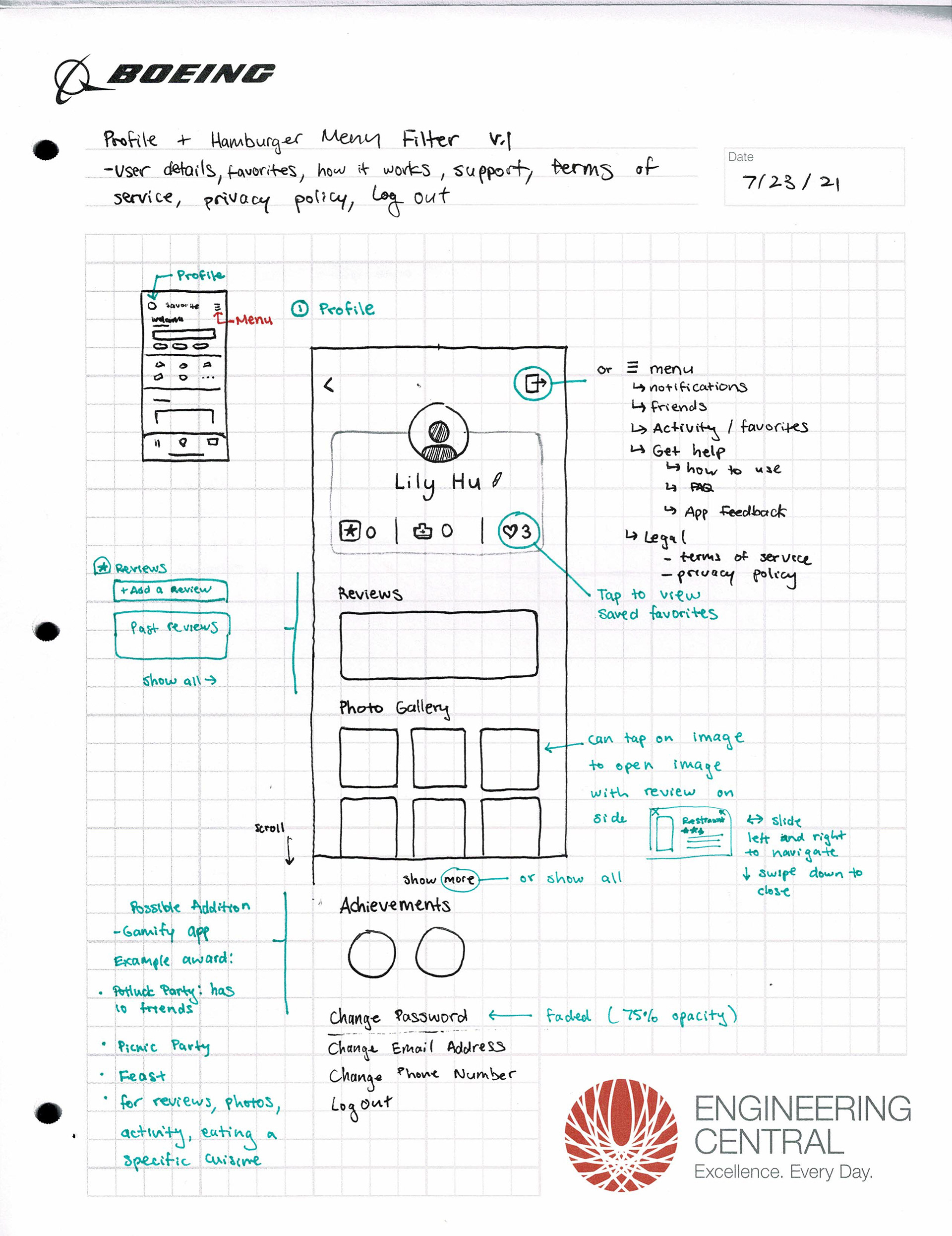
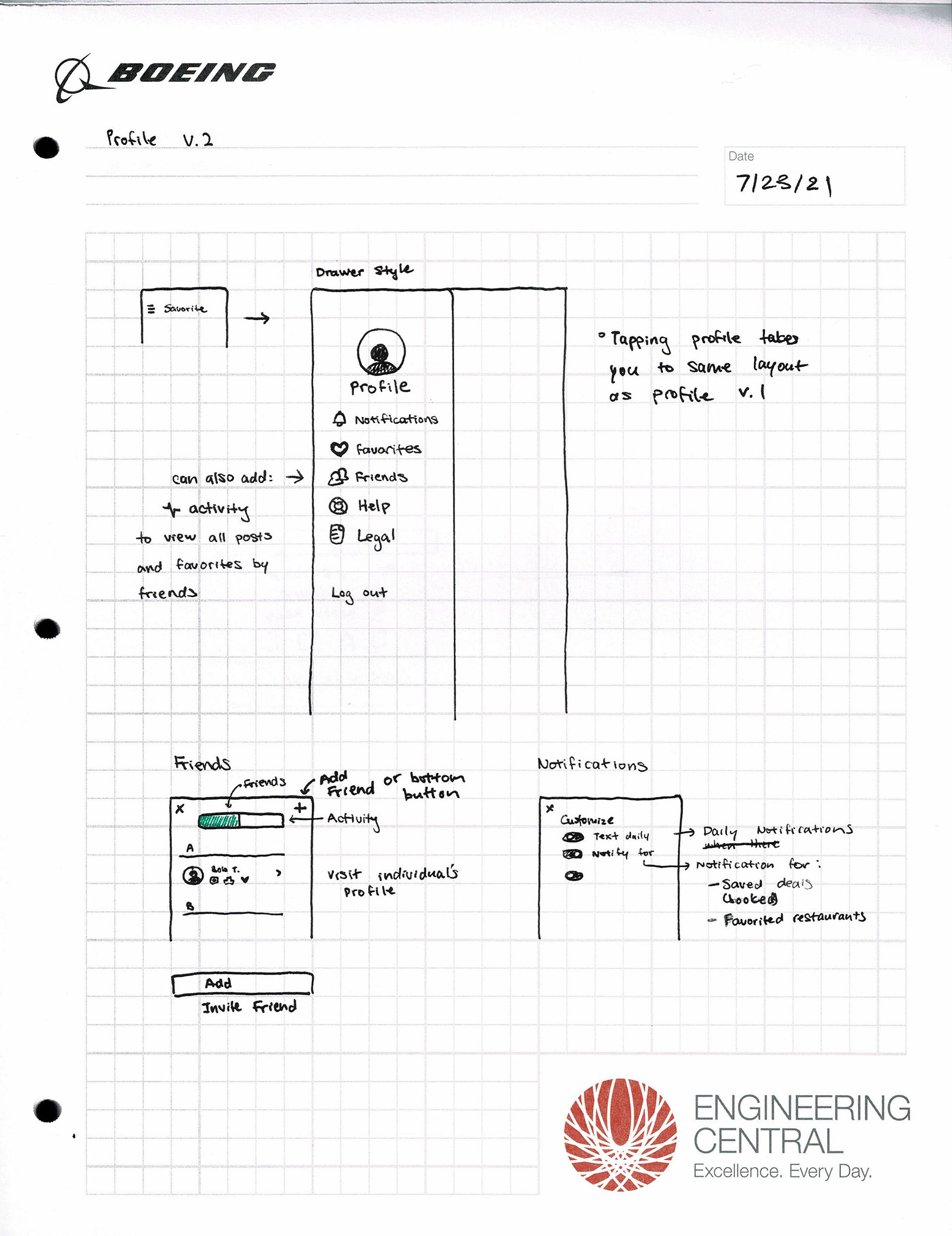
Ideation
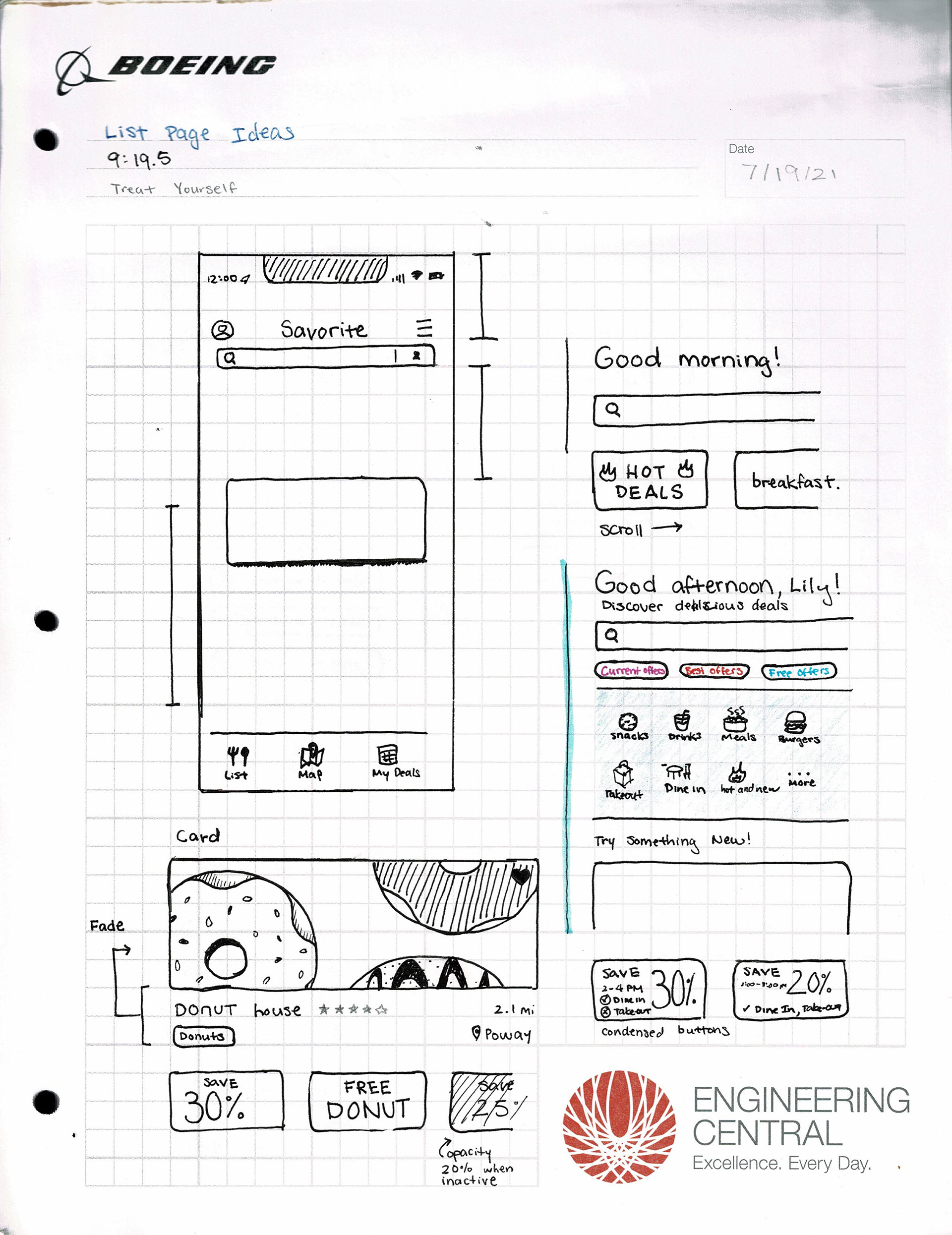
Preliminary Sketches
Design
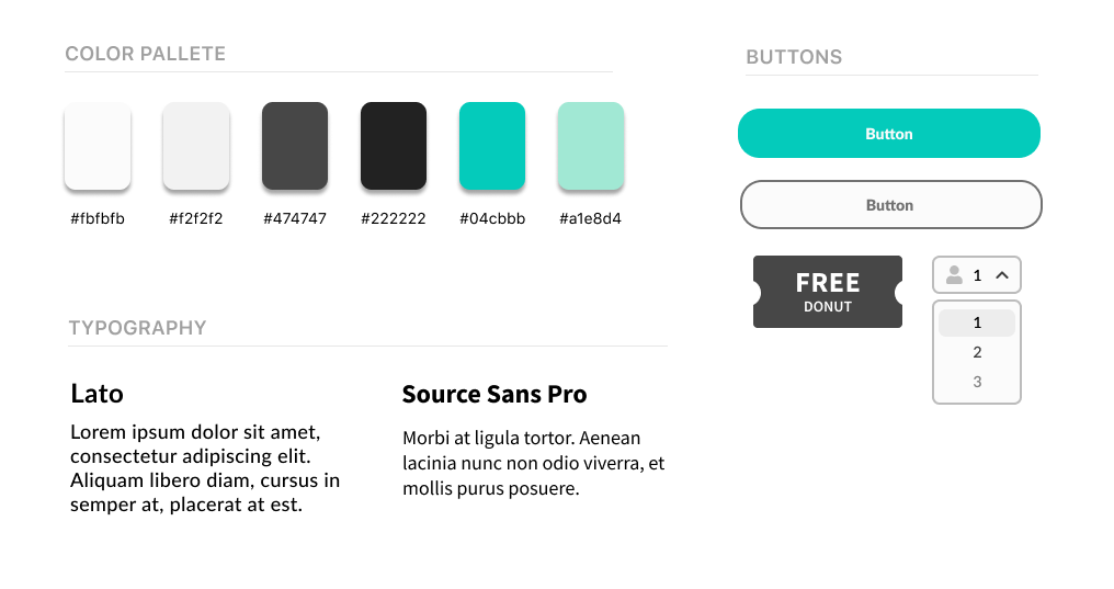
Style Guide
When I asked the directors why they chose teal as Savorite's color, they explained that like the color, they wanted to be light and playful while being sophisticated and professional. Therefore, I felt it was critical to convey those feelings in the redesign.
Iterations
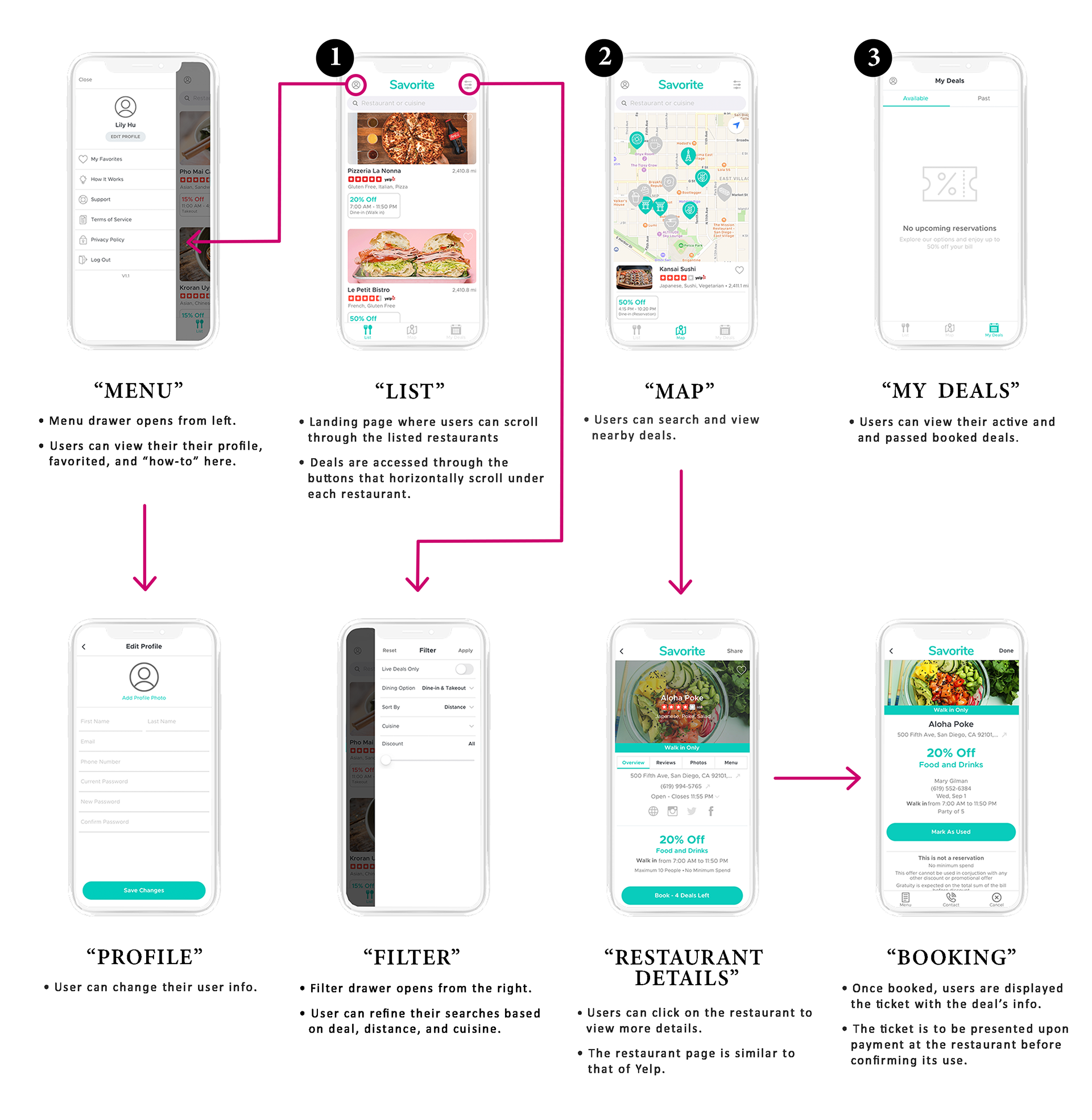
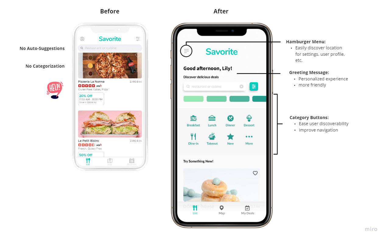
Redesign Proposal
At the two week deadline, I proposed the following additions to improve user navigation and discoverability:
Reapproaching the Problem
Interviewing the same 6 interviewees from before, I conducted A/B testing to determine what users liked or disliked from the proposed design. I received positive feedback from all interviewees on the categorization of the app, but many saw that there can be improvements made on the search and filter functions.
Returning back to the drawing board, I decided to tackle the problems of the app from a new perspective. The user perspective. Here are just a few additions and changes I have made:

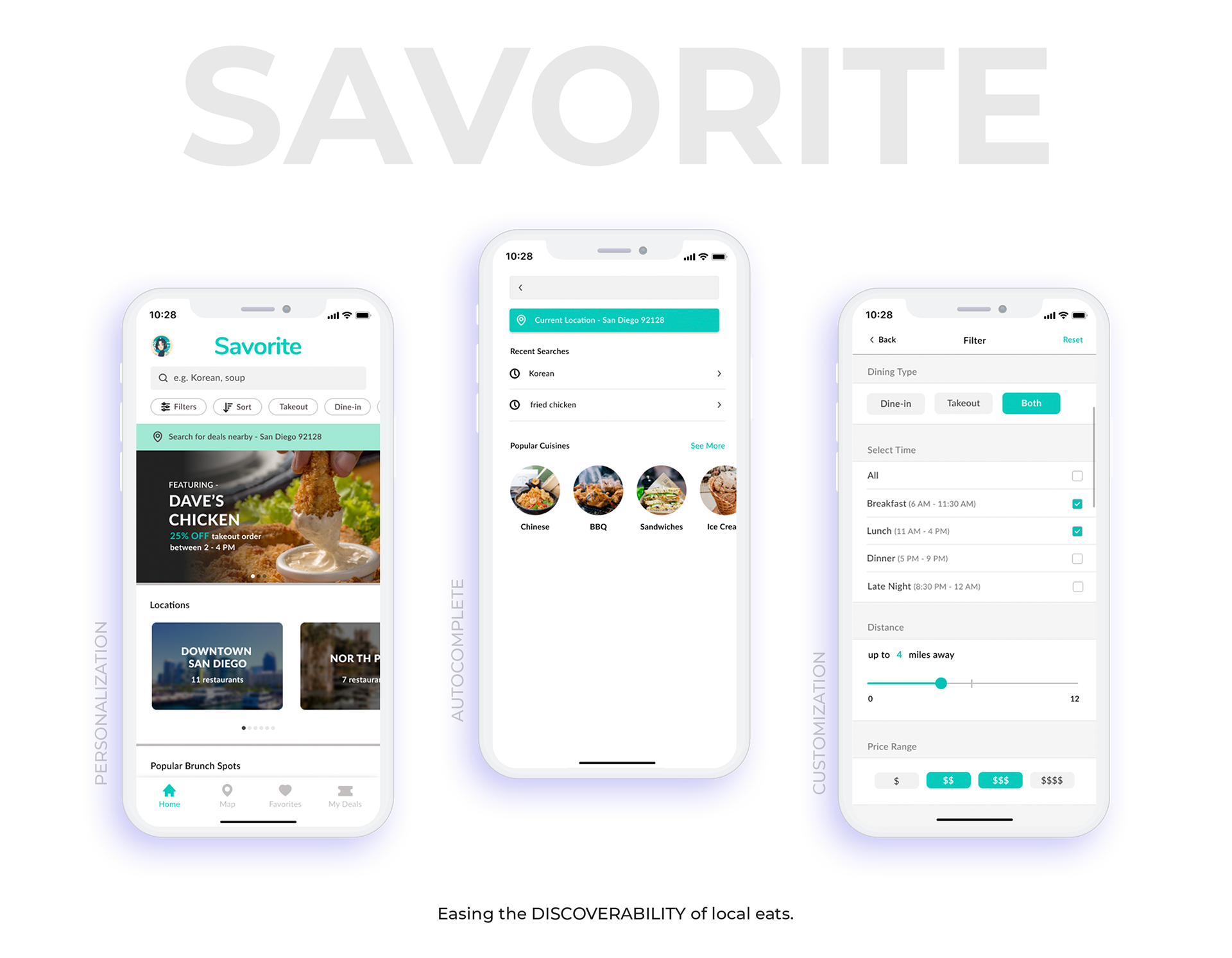
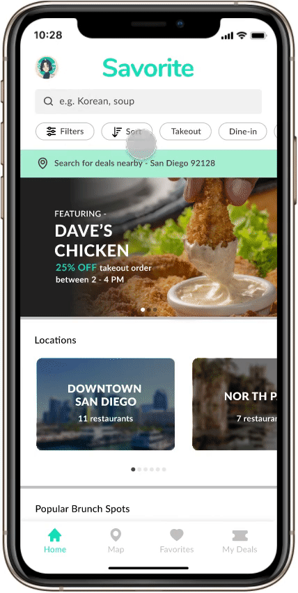
Search Bar
Auto-completions, past searches, and recommendations ease and reduce time searching.
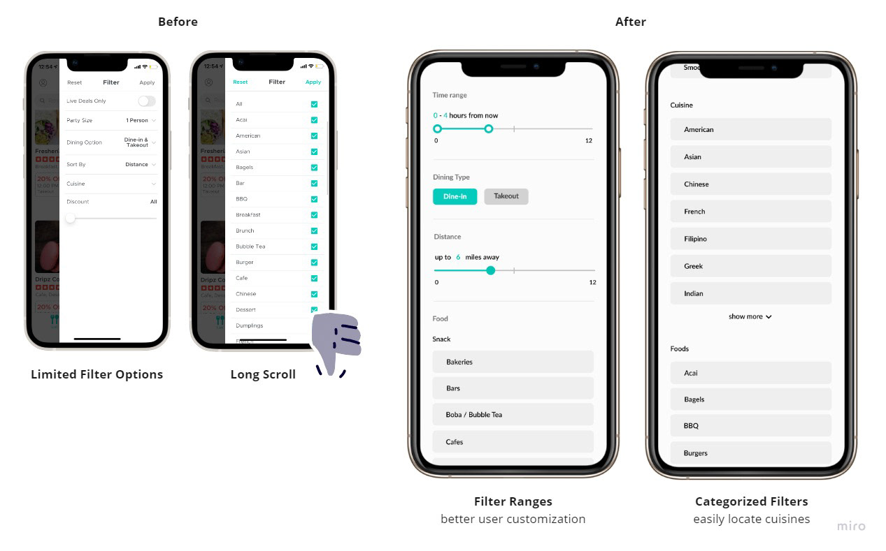
Filter Page
Condensed page to improve visibility of filter options and decrease overall user effort.
Categories and Sub-Sections
Categories sections such as locations available, popular spots based on time of the search, and nearby deals help reduce search fatigue.
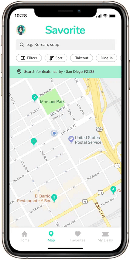
Map Search
View nearby restaurants and their deals directly on the map.
🕹️ Play with Prototype 🕹️
Reflection
Constraints
When I began my Savorite design internship, the Savorite app could already be downloaded from the app store. The app was new and had a small user base with few critical reviews. Because the startup was a small non-profit, they were unable to provide the resources and mentorship. Due to other priorities, I was given a maximum of two weeks to complete a redesign. With a large time, money, and resource constraint, the redesign of their apps was a large learning experience for me.
Next Steps
With more time, I would like to conduct user testing on my second iteration of the Savorite App. In addition, I would also like to make adjustments in the other aspects of the app such as creating a more seamless onboarding experience, voucher design, and user profile.
What I Learned
Centralize the problem.
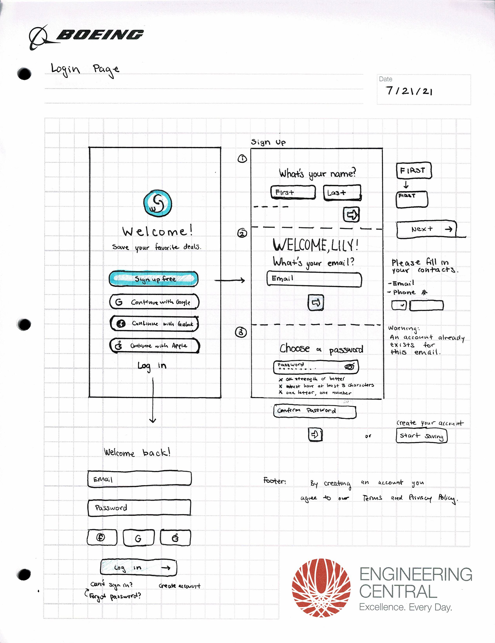
Redesigning the entire app is a large task with a short deadline. At first, I tried to tackle all the issues with the app including the login and sign-up process. The directors also encouraged adding features to the app that hadn't already existed such as finding creative ways to gamify the app or implementing options to purchase through the app. With too many problems to resolve, I was quickly overwhelmed. By centralizing the problem to one key issue at a time, I was able to fully address a single issue and create a better experience for users in that aspect.
It's not always about the aesthetics.
The first priority of the app should be that it serves its function and that it serves its function well. While having a simplistic design may be nice, adding features allows for a better user experience.
_______________________________________________________________________________________________________________________
Questions or want to learn more?
I'd love to chat with you more about my ideas, thought processes, or...
Thank you!

